祇園祭2025ラベル
- TYPE:
- 商品ラベル
- CLIENT:
- 株式会社祇園ビール
- SCOPE:
- アートディレクションデザイン
- TEAM:
- AD/D:友草裕太
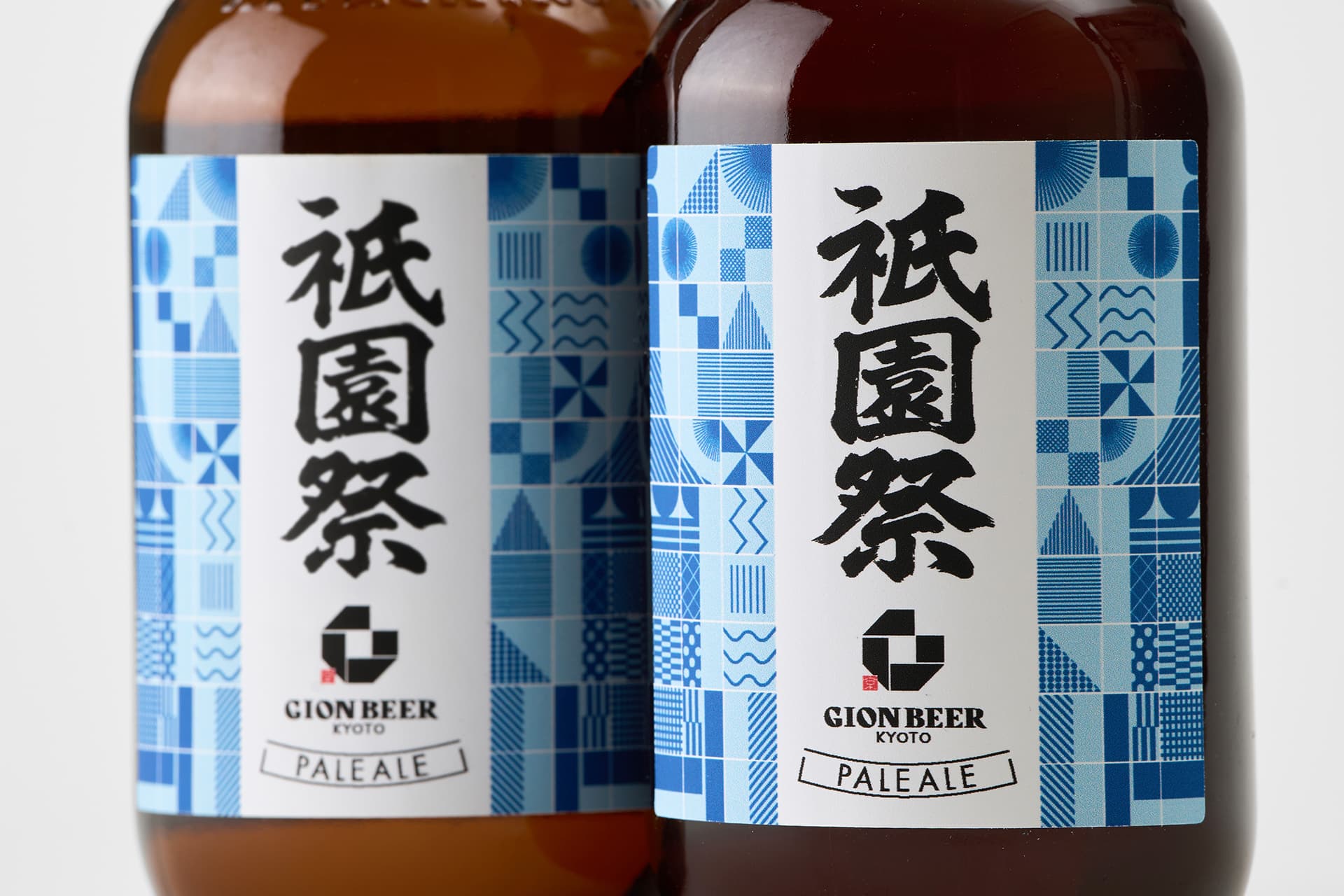
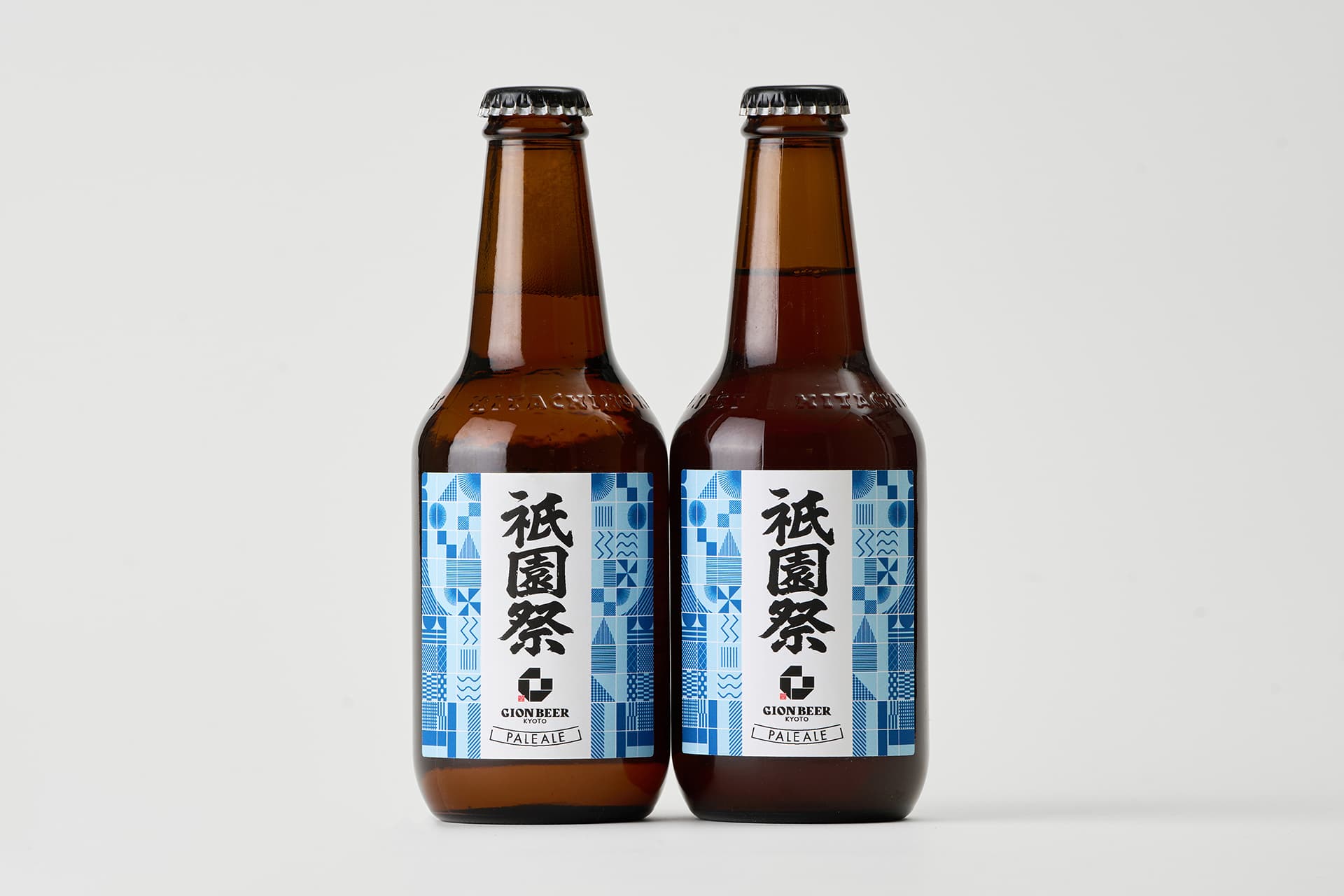
祇園ビールさんの祇園祭2025ラベルを担当しました。
繁栄・発展を意味する市松模様から想起した矩形の幾何学模様で構成し、2本並べると祇園祭の山鉾(山車)の形が見えてくるよう形づくりました。暑い夏に目から少しでも涼しさを届けたいと思い、ブルーをベースにしています。
祇園祭の際に店頭のみで販売された希少ラベル。
祇園祭という文字を一番大きく扱わないといけないという制約の中、一過性のものということと当時の話題性を汲んで筆文字はAIでベースを制作し、調整したものを使用。
どんどん進化するAIを言葉ではなく制作自体に取り入れたのは初めてで、少し可能性を感じる制作となりました。
____
I was in charge of the Gion Beer – Gion Festival 2025 label.
The design is composed of rectangular geometric patterns inspired by the ichimatsu pattern, a traditional motif symbolizing prosperity and growth.
When two bottles are placed side by side, the silhouette of a Gion Festival yamahoko float emerges.
To bring a sense of visual coolness during Kyoto’s hot summer, the label is based on shades of blue.
This was a limited-edition label, sold exclusively in-store during the Gion Festival.
Reflecting its temporary nature and the topical context at the time, the calligraphy was created using an AI-generated base, which was then carefully adjusted and refined.
This was my first time incorporating the rapidly evolving capabilities of AI not just as a concept, but directly into the production process itself—and it became a project that allowed me to sense new creative possibilities.