自然と選びたくなる・持っていて恥ずかしくないペーパーバッグ
“いかにも会社の紙袋”や“歩く広告塔”のように主張するのではなく、
日常でも違和感なく持てるたたずまいが求められていました。
- TYPE:
- 企業VI
- CLIENT:
- 株式会社ライズ広告社
- SCOPE:
- アートディレクションデザイン
- TEAM:
- AD/D:友草裕太
大阪と東京を拠点に広告制作をされている
とことん話せる広告会社 ライズ広告社さんのペーパーバッグのリニューアルを担当しました。
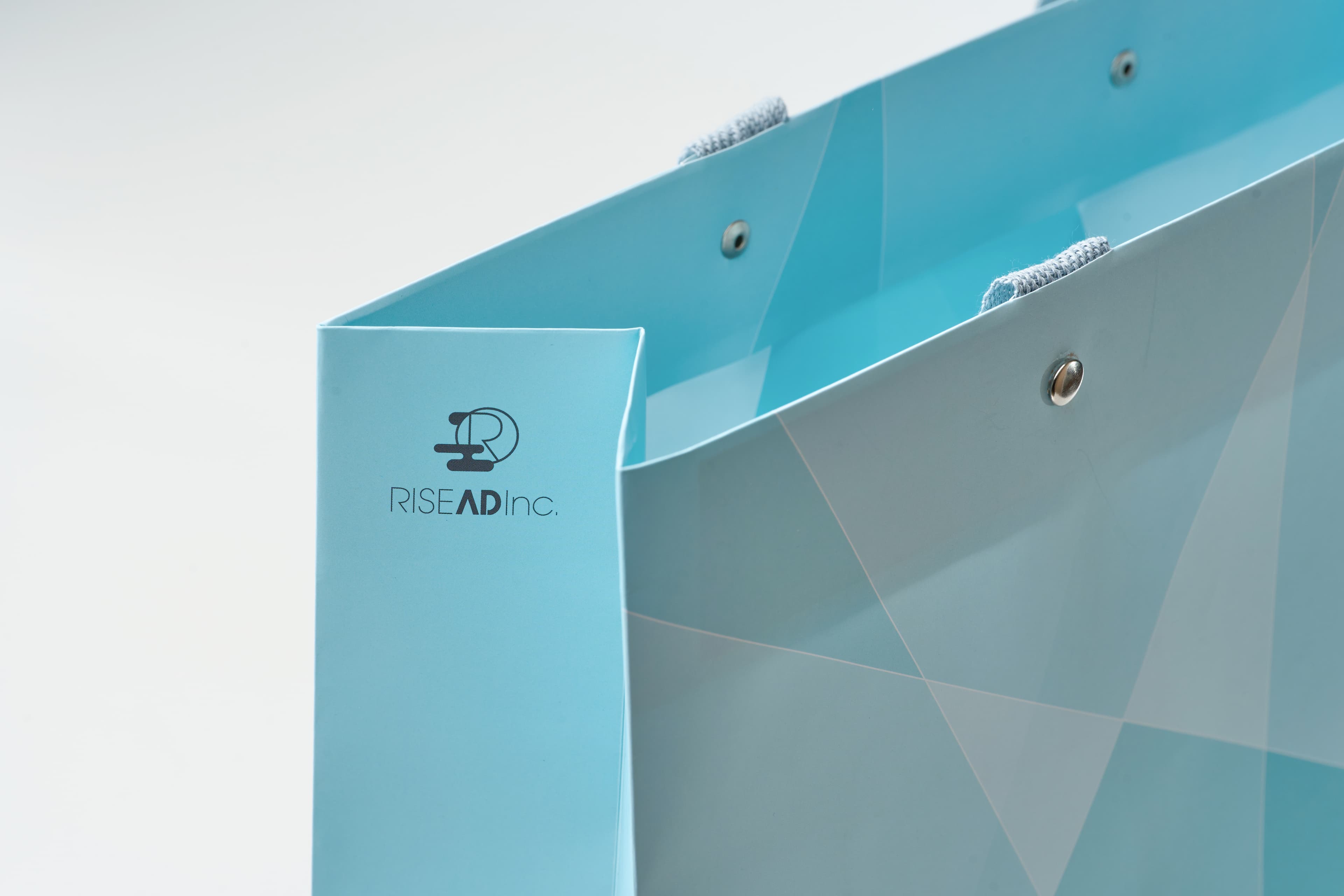
“いかにも会社の紙袋”や“歩く広告塔”のように主張するのではなく、日常でも違和感なく持てるたたずまいが求められていました。
使う人が自然と選びたくなり、持っていて恥ずかしくない存在を目指しています。
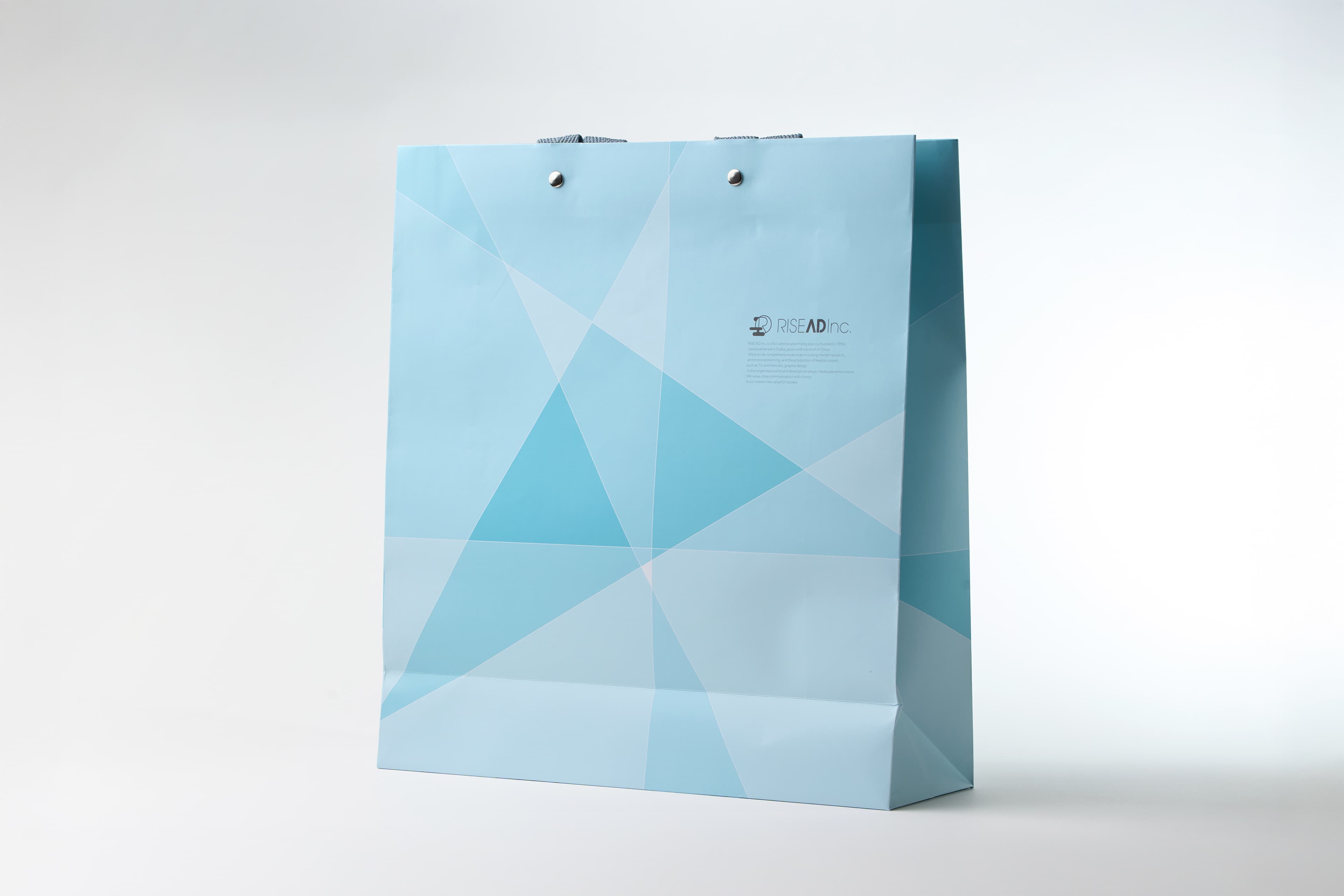
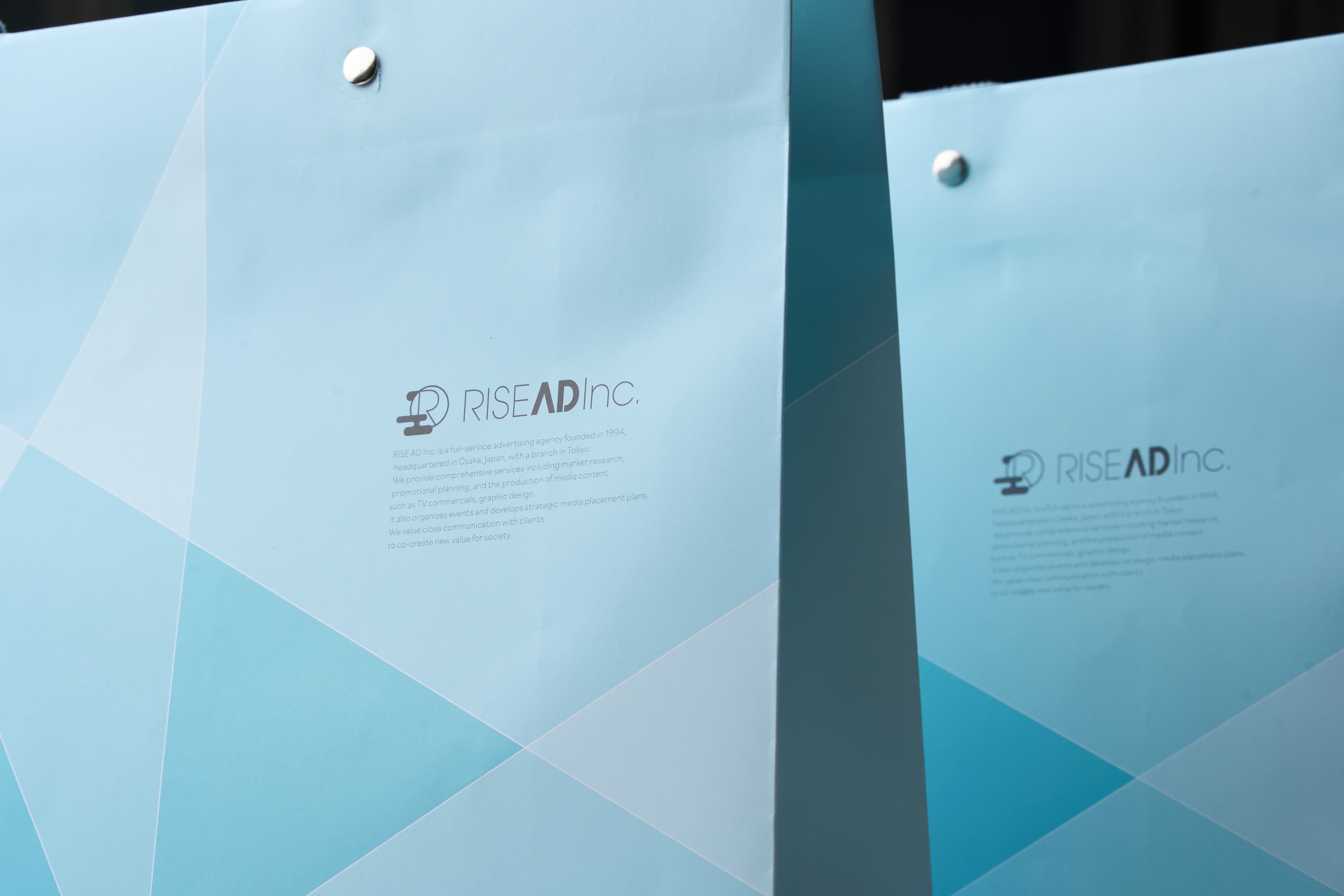
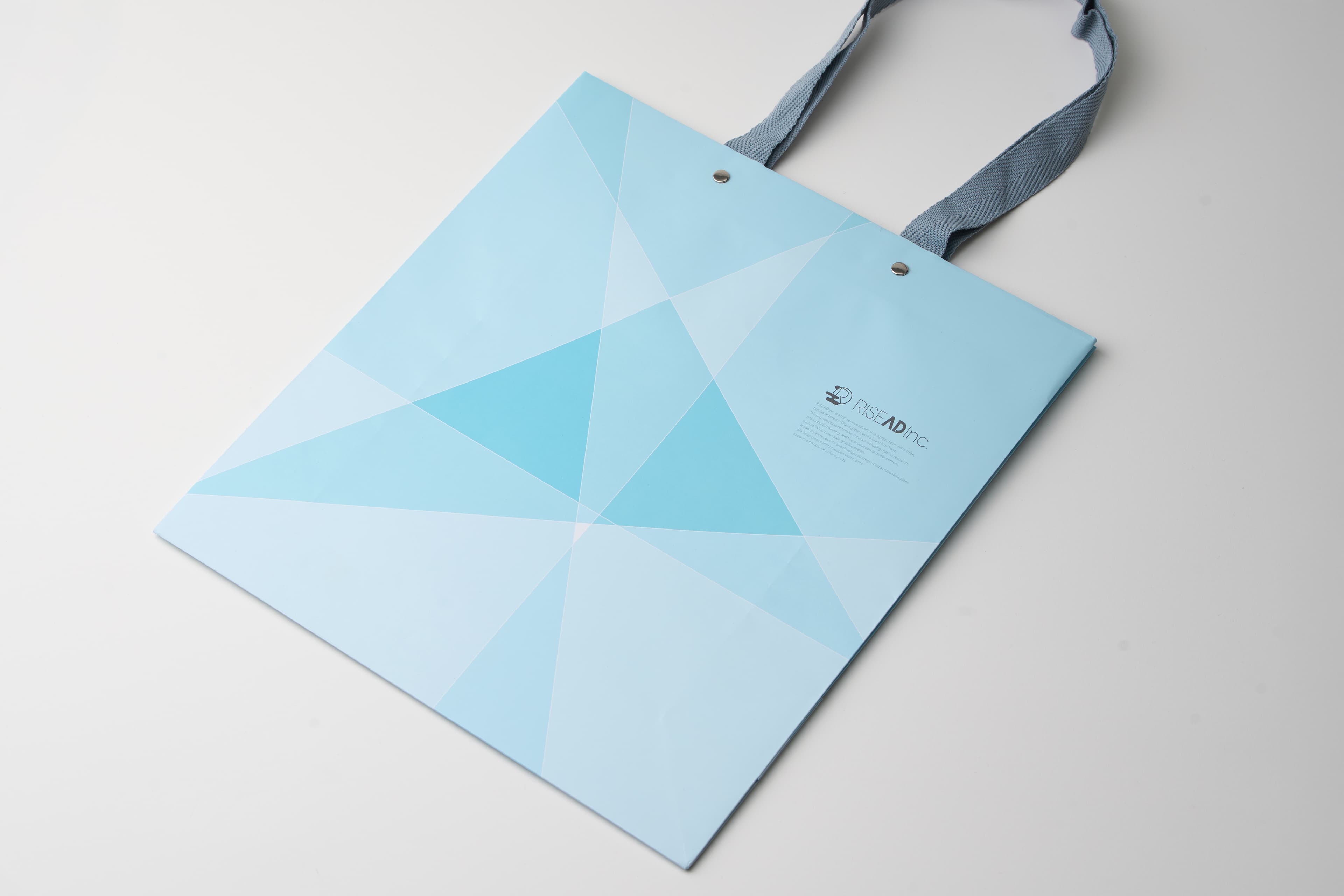
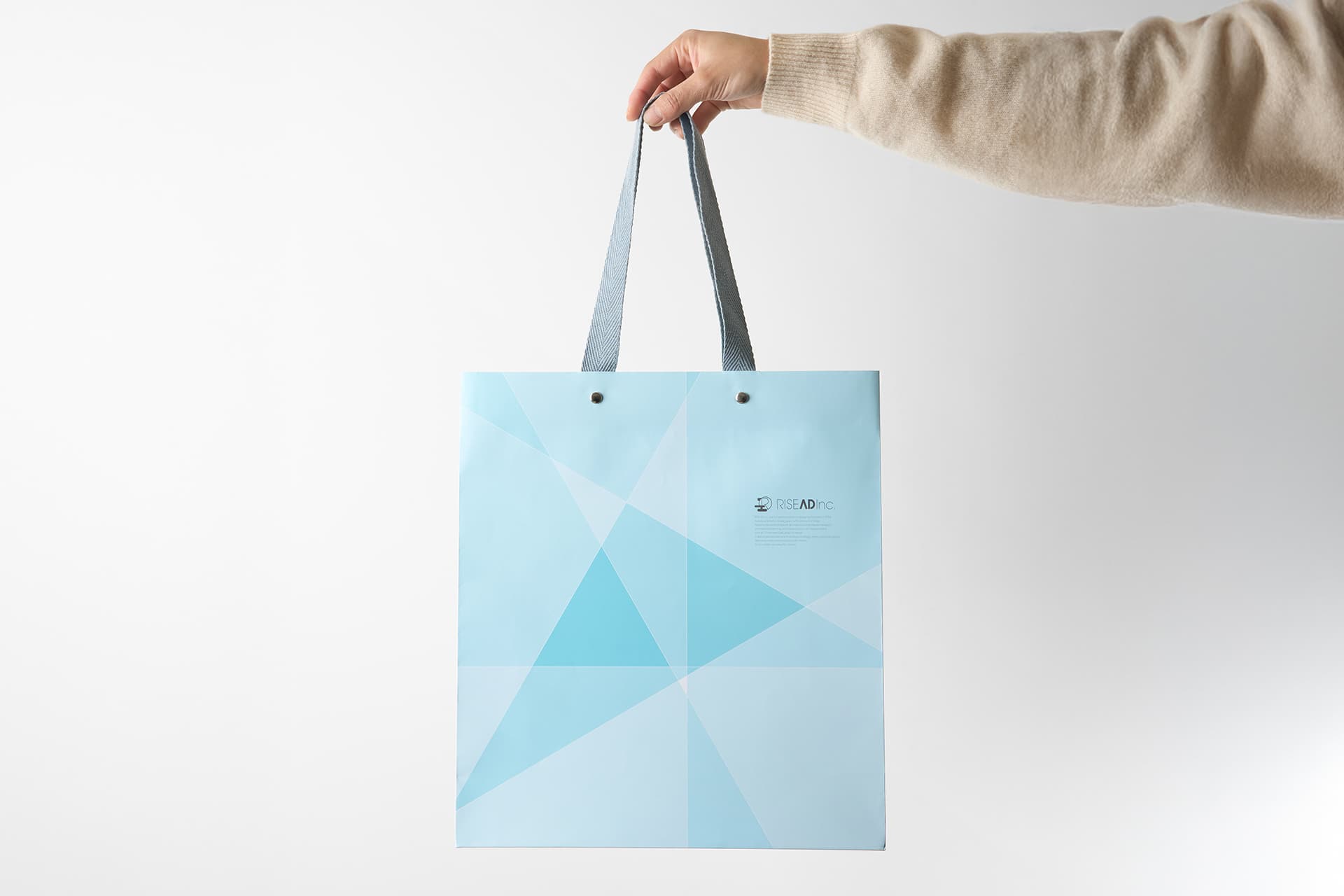
ライズ広告社さんが大切にされている「とことん話すと見えてくる」という言葉をもとに、対話によって本質にたどり着くプロセスとして捉え、多角的な視点で話し・考えることをスポットライトに喩え、スポットライトが重なり合った部分が次第に濃くなり、やがて“AD(広告・本質)”を象徴する三角形として浮かび上がるということをビジュアル化しました。
ペーパーバッグを遠目に見ると宝石のカットのようにも見え、光を当てることで原石の価値を輝かせるという意味や対話によって価値を引き出す姿勢を視覚化しています。
若手からベテランまで、気兼ねなく使えるたたずまいを目指しました。
日常の中で自然と選ばれる存在となることを意図しています。
___
実際に持って街を歩いてみたんですが
何人かの男女にペーパーバッグを見られている感覚がありました。
何の紙袋だろう?どこのブランドかな?みたいに少しでも気にかけてもらえて
尚且つ普段の自分の一部として持ってもらえるのが理想です。
__
I was responsible for the renewal of the paper bag design for Rise Advertising Company
, an advertising agency based in both Osaka and Tokyo.
Rather than creating something that looked like a typical corporate paper bag or a “walking advertisement,” the goal was to design a presence that could naturally fit into everyday life without feeling out of place.
We aimed for something people would instinctively choose to carry — something they could hold comfortably and confidently in public.
The design was inspired by Rise Advertising Company’s philosophy:
“By talking thoroughly, the essence becomes visible.”
We interpreted this as a process of reaching the core of something through dialogue.
The visual concept expresses multiple perspectives speaking and thinking together, represented as overlapping spotlights. As these spotlights intersect, the overlapping areas gradually deepen in tone, eventually forming a triangle that symbolizes “AD” — both advertising and essence.
From a distance, the paper bag can also resemble the cut of a gemstone.
This visual metaphor reflects the idea of illuminating the hidden value within something raw, while also expressing the company’s attitude of drawing out value through conversation and communication.
The design was created with the intention that people of all generations — from younger staff to veterans — could use it comfortably and naturally.
We wanted it to become something people would instinctively choose in their daily lives.
___
After the design was completed, I actually carried the paper bag while walking around the city.
I had the feeling that several people — both men and women — were noticing it, almost as if they were wondering:
“What brand is that?”
“What kind of paper bag is it?”
Even just a small moment of curiosity like that felt meaningful to me.
Ideally, the bag becomes something that naturally blends into the user’s everyday identity while quietly attracting attention from others.